Turn on suggestions
Auto-suggest helps you quickly narrow down your search results by suggesting possible matches as you type.
Showing results for
- NOW Community
- LG
- LG TV (LA860) Now TV playback interface changed - ...
Options
- Mark Topic as New
- Mark Topic as Read
- Float this Topic for Current User
- Follow discussion
- Subscribe
- Mute
- Printer Friendly Page
Anonymous User
Not applicable
06-02-2017 21:10 - edited 06-02-2017 21:22
Options
- Mark as New
- Bookmark
- Subscribe
- Mute
- Permalink
- Report Abuse
LG TV (LA860) Now TV playback interface changed - changelog anywhere?
Hi,
The UI of the Now TV app on my LG TV changed literally overnight.
I now get "transparent" grey and blue rectangles that fill the lower third of the screen and the controls are left justified. Before there was no coloured panels and the controls were centred.
It looks much nicer.
This made me wonder if there is some kind of change log somewhere to say what has been changed?
Is it that well organised or is it just a tangle of shared responsibility (deniability!?) between NowTV and LG such that the end user just gets seemingly random updates and has to just play around to see what had changed?
8 REPLIES 8
SeeMoreDigital

Legend 5
06-02-2017 21:12
Options
- Mark as New
- Bookmark
- Subscribe
- Mute
- Permalink
- Report Abuse
How odd @Anonymous User,
Can you upload a photo of what you're seeing please?
Anonymous User
Not applicable
06-02-2017 21:26 - edited 06-02-2017 21:28
Options
- Mark as New
- Bookmark
- Subscribe
- Mute
- Permalink
- Report Abuse
SeeMoreDigital
Legend 5
06-02-2017 21:34
Options
- Mark as New
- Bookmark
- Subscribe
- Mute
- Permalink
- Report Abuse
@Anonymous User wrote:Sure, if this works...?
Edit: It worked! 🙂

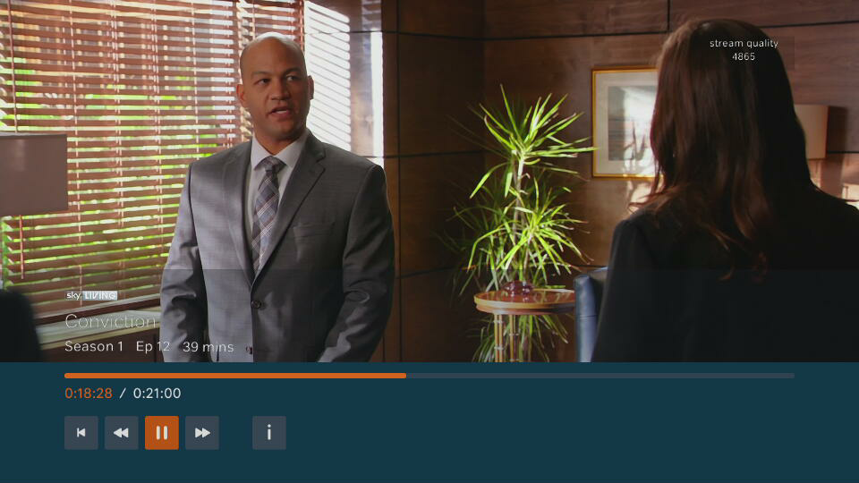
Wow, that sure does look different!
When you go to the 'Home' screen and navigate down to 'My Account' and select 'Enter/OK'. What 'app' version do you see at the top right of the screen?
Cheers
Anonymous User
Not applicable
06-02-2017 21:47
Options
- Mark as New
- Bookmark
- Subscribe
- Mute
- Permalink
- Report Abuse
The version number is 2.15.3
SeeMoreDigital
Legend 5
06-02-2017 22:10
Options
- Mark as New
- Bookmark
- Subscribe
- Mute
- Permalink
- Report Abuse
I've just logged into the NOW TV app on my LG television in my bedroom and I have the new layout too @Anonymous User 😁
Anonymous User
Not applicable
06-02-2017 22:13
Options
- Mark as New
- Bookmark
- Subscribe
- Mute
- Permalink
- Report Abuse
Thanks SeeMore, and thanks for all your responses.
This just leaves my original question of how to find out what else might have been changed. 🙂
Anonymous User
Not applicable
08-02-2017 13:45
Options
- Mark as New
- Bookmark
- Subscribe
- Mute
- Permalink
- Report Abuse
Hi @Anonymous User
Thanks for getting in touch usually details of updates are in the app store if you go to the app store and locate Now TV then go to the description you should see Details of the update there in either the app description or Update description 🙂
Cheers
Eddie
commanda6
Legend 5
08-02-2017 13:55
Options
- Mark as New
- Bookmark
- Subscribe
- Mute
- Permalink
- Report Abuse
@Anonymous User wrote:
One of the other things that's changed is that Continue Watching and Watchlist are on the same screen, in two ribbons. And instead of telling to you name of the programme, it tells you the title of the episode, so you have to squint at the thumbnail to work out what the show is.
And the shows in Continue Watching are all 70-80% of the way through the episode you just watched. It doesn't cue up the next episode, it just assumes you didn't finish watching the previous one.
I've moaned about this before, and the it went away, but now it's back.
@Anonymous User , I have to agree with you.
I don't like the new my TV section layout on LG TVs. The my TV section needs to go back to the way it was (the layout of that is used on NowTV/Roku hardware)
I do however like the new content playback interface. I think the contrast is good, which might make NowTV easier to use the some users
I do not work for Now . I am simply a Now customer trying to help I am a Community Contributor This means that I know a lot about the service. But just like you I am still a customer. This means I cannot help you with issues that would involve looking into your account directly. A member of the now TV forum team or live chat will need to assist you with these issues.
